Introduction
Color plays a crucial role in design, influencing emotions, perceptions, and aesthetics. Among the vast spectrum of colors, blue and green stand out as two harmonious choices that can evoke a sense of tranquility and balance. This article explores the complementary relationship between blue and green in design, examining their psychological impact, practical applications, and the principles of color theory that underline their effectiveness. By understanding how these colors work together, designers can create visually appealing and emotionally resonant spaces that captivate their audience.
The Psychology of Blue and Green
1. The Essence of Blue
Blue is often associated with calmness, stability, and trustworthiness. It evokes feelings of serenity and peace, making it a popular choice for corporate branding, healthcare facilities, and spaces designed for relaxation. Research indicates that blue can lower heart rates and reduce feelings of anxiety, creating an inviting atmosphere.
2. The Refreshing Nature of Green
In contrast, green symbolizes growth, renewal, and nature. It is a color that reflects the beauty of the natural world and is linked to feelings of safety and comfort. Green is often used in design to create a refreshing ambiance that fosters creativity and productivity, making it suitable for workplaces, educational environments, and homes.
3. The Emotional Spectrum
Together, blue and green can create a spectrum of emotions that range from calmness to inspiration. While blue instills a sense of trust and reliability, green promotes balance and rejuvenation. This emotional synergy makes them ideal companions in design, allowing for versatile applications across various industries.
Practical Applications of Blue and Green in Design
1. Interior Design
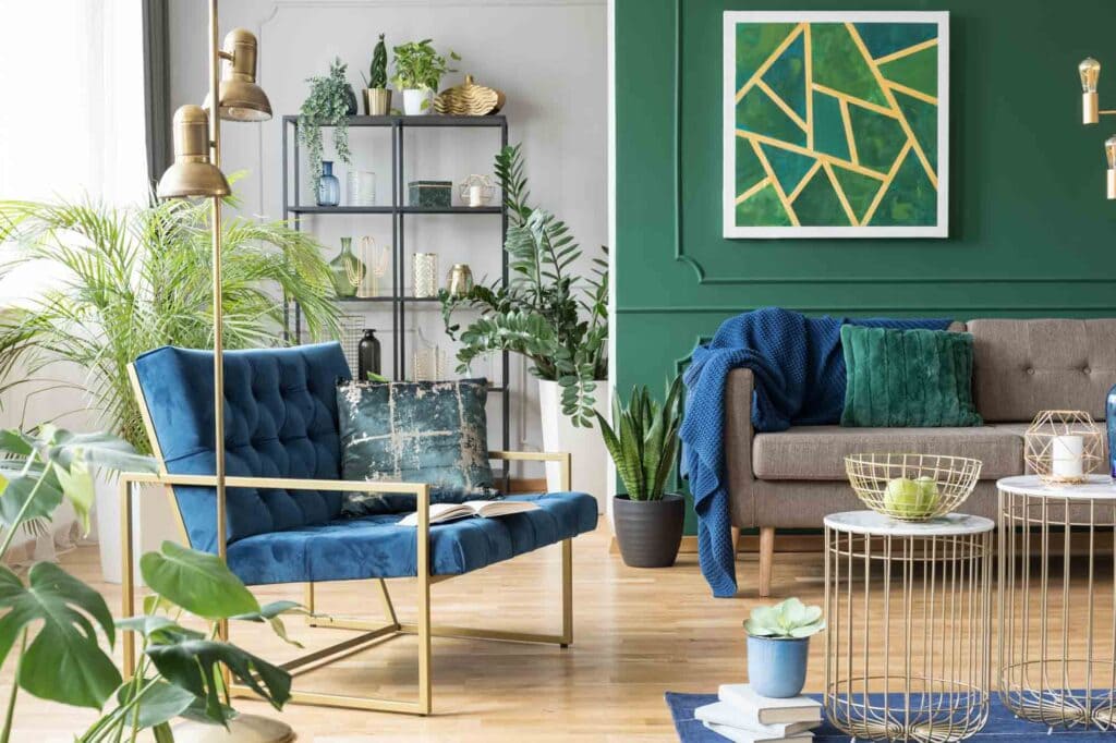
In interior design, blue and green can be used to create soothing environments. For example, a living room painted in soft blue tones can be complemented by green accents, such as plants or cushions, to add warmth and life to the space. This combination can be particularly effective in bedrooms and relaxation areas, where tranquility is essential.
2. Branding and Marketing
Many brands leverage the calming effects of blue and the refreshing qualities of green in their marketing materials. Companies focused on health and wellness often use these colors to convey trust and rejuvenation. For instance, health food brands might use green in their packaging to emphasize natural ingredients while incorporating blue to establish credibility and reliability.
3. Web Design
In web design, blue and green can enhance user experience and engagement. Websites that feature a blue background with green buttons or highlights can guide users’ attention effectively while providing a visually appealing layout. This combination can be particularly useful for e-commerce sites, educational platforms, and environmental organizations, promoting user trust and comfort.
The Color Wheel and Complementary Harmony
Understanding the color wheel is fundamental for designers aiming to create harmonious compositions. Blue and green are analogous colors, meaning they are next to each other on the color wheel. This proximity results in a natural and cohesive visual effect, allowing for a seamless blend when used in design.
1. Shades and Tints
Designers can play with various shades and tints of blue and green to achieve the desired effect. Darker shades can add depth and sophistication, while lighter tints can create an airy and light atmosphere. This versatility allows designers to tailor their color choices to specific contexts, whether aiming for a modern aesthetic or a more traditional feel.
2. Contrast and Balance
While blue and green complement each other, designers should also consider incorporating contrasting elements to create balance. For instance, adding touches of warm colors, like orange or yellow, can help to break the coolness of blue and green while enhancing their visual impact. This technique can be particularly effective in creating focal points within a design.
Table: Color Combinations and Their Effects
| Color Combination | Emotional Response | Common Applications |
|---|---|---|
| Soft Blue + Soft Green | Calmness, tranquility | Bedrooms, spas, wellness centers |
| Dark Blue + Light Green | Stability, rejuvenation | Corporate branding, offices |
| Turquoise + Olive Green | Creativity, harmony | Art studios, creative spaces |
| Navy + Mint | Sophistication, freshness | Weddings, upscale events |
Q&A Section
Q: What industries benefit most from using blue and green in design?
A: Industries such as healthcare, wellness, environmental organizations, and tech companies often benefit from using blue and green due to their calming and trustworthy qualities.
Q: How can I effectively incorporate blue and green in my home?
A: Start by painting walls in soft blue or green hues and complementing them with furniture and decor in the other color. Adding plants can also enhance the refreshing quality of green.
Q: Are there any cultural considerations when using these colors?
A: Yes, while blue and green are generally positive colors in Western cultures, their meanings can vary across different cultures. It’s essential to research cultural connotations, especially if designing for an international audience.
Q: Can blue and green work in combination with other colors?
A: Absolutely! Blue and green can harmonize well with neutral colors like white, gray, or beige. They can also contrast with warmer colors like orange or red to create dynamic designs.
Conclusion
The combination of blue and green offers designers a powerful palette for creating environments that evoke tranquility, trust, and renewal. By understanding the psychological effects of these colors, their practical applications, and the principles of color theory, designers can harness their potential to create visually stunning and emotionally resonant spaces. Whether in interior design, branding, or web design, blue and green continue to complement each other, providing endless possibilities for creative expression. As you explore these colors in your projects, remember that their harmonious relationship can elevate your design to new heights, captivating your audience and leaving a lasting impression.

